Reducing Grab-and-Go Behavior: A site redesign enhances user engagement
A nonprofit publisher with 50 journals in the life, biomedical, and physical and social sciences, Annual Reviews publishes highly cited expert review articles.

Challenge
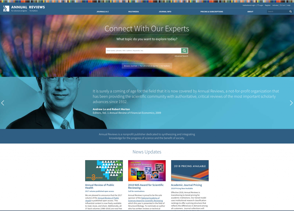
Annual Reviews wanted a complete redesign of their eight-year-old website. Constructed before the era of responsive design, the end-user experience was cumbersome on mobile devices. Online purchasing was impeded by an unintuitive eCommerce flow, limiting the revenue stream. The search mechanism returned articles, but multimedia content required a separate search. And the site’s design was disjointed: abstract and full-text article pages did not relate to one another, and there was no distinction among the individual journals’ branding. Finally, the homepage was text heavy, crowded with content in an attempt to appeal to Annual Reviews’ three distinct kinds of visitors—librarians, authors, and researchers—and leaving no room for visual elements to reinforce brand values.
Goals
Annual Reviews wanted their new website to attract new users, encourage existing users to visit more often, and sustain and lengthen user sessions. By personalizing the site as well as engaging readers at the article level, Annual Reviews also hoped to sustain and lengthen site visits by challenging the “grab-and-go” behavior of visitors who stayed long enough only to download a PDF.
Solution
A completely redesigned website was constructed with Atypon Page Builder, a widget-based UI/UX design tool. The site now provides:
A modern UI and UX:
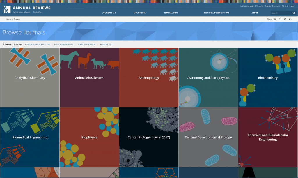
Beautiful, journal-specific branding is carried through from the publications browse page to the landing page for each journal all the way through to the article, table of contents, and even the denials page. Responsive design provides consistent experience across every screen size and device, and persistent menus and intuitive navigation encourages users to browse the variety of content types, including multimedia. Various elements of a review article’s content—tables, figures, multimedia, section navigation, and so on—percolate up in search results and issue and article pages, quickly surfacing engaging features for readers and enticing them to make purchases.
Enhanced search and discovery:
The new site strengthens discovery by simplifying the search mechanism: Users can search across all content types (such as articles, videos, and editorial directory databases) simultaneously from multiple locations in the interface. Search results are sorted in separate tabs according to content type, and search facets enable users to drill down and refine search results with numerous filters customized to each search topic. Collaborative filtering, fueled by Atypon Experience Platform’s recommendation engine, surfaces related content likely to interest each user based on what other users with a similar profile search for.
A personalized experience for each user type:
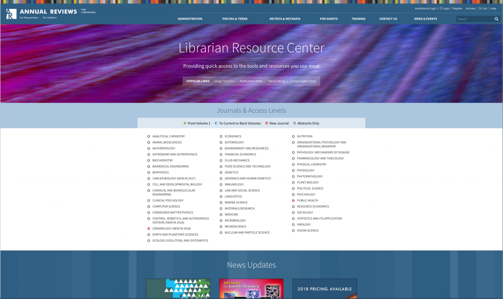
Alternate homepages for authors, librarians, and researchers, bring user-specific content, resources, and links to the fore while maintaining an inviting, functional design.
A streamlined eCommerce journey:
To make purchasing simpler, the number of required fields on the registration page was reduced, and customers can now log in via their social media accounts. Purchases can be made without registering via a new guest checkout interface, and users can review the items in their cart before purchase. Users can save the items in their cart for purchase at a later time.
Integrated multimedia:
Using Atypon Experience Platform’s Digital Objects technology, each multimedia file now carries its own digital object identifier, or DOI, and can therefore be surfaced along with related article and journal content in search results. Meanwhile, article search results alert users to any associated tables, figures, or multimedia content.
Results
Prior to the redesign, the ratio of PDF-to-HTML usage was approximately 2:1 and site visits were brief, indicating “grab-and-go” user behavior. After the redesign, that ratio began moving beyond parity and toward a flip, with users now staying onsite to read articles nearly twice as often as they are visiting just to download a PDF. In addition, the number of onsite searches has doubled, indicating sustained engagement with the entirety of the site’s content.
Constructing the site with Atypon Page Builder has given Annual Reviews direct, real-time control over the site’s content and branding. The easy-to-use tool enables both technical and non-technical staff to modify the site’s design and user experience in real time and roll out those changes to a single page, a single journal, or across multiple journals simultaneously.
The Annual Reviews site’s fresh look and personalized, frequently updated content gives visitors what they need for a productive research experience—a friendly, strongly branded, consumerized design with intuitive navigation that encourages visitors to engage with relevant content immediately.


